I did some more work on the Inquisitor, glazed the text (it looks so crude as it's built from the red and all the range disappears) fixed the lettering a little, then added some chipping. I also resided the Hammer into darker, crimson hue. I really like how he ended up now.
... Really worth the extra 15min.
I also got great camera advice from a professional photographer friend, so Panasonic Lumix G3 is on the shopping list ASAP.
Valencia got a shoulder guard (to be riveted I think) and subtle cuts to tie her attire with the shirt and is now ready for the primer!
I really dig that Valencia conversion. What's the floating ribbonnext to it? it looks a bit misplaced??? Or is it just the angle? Can't wait to see it painted.
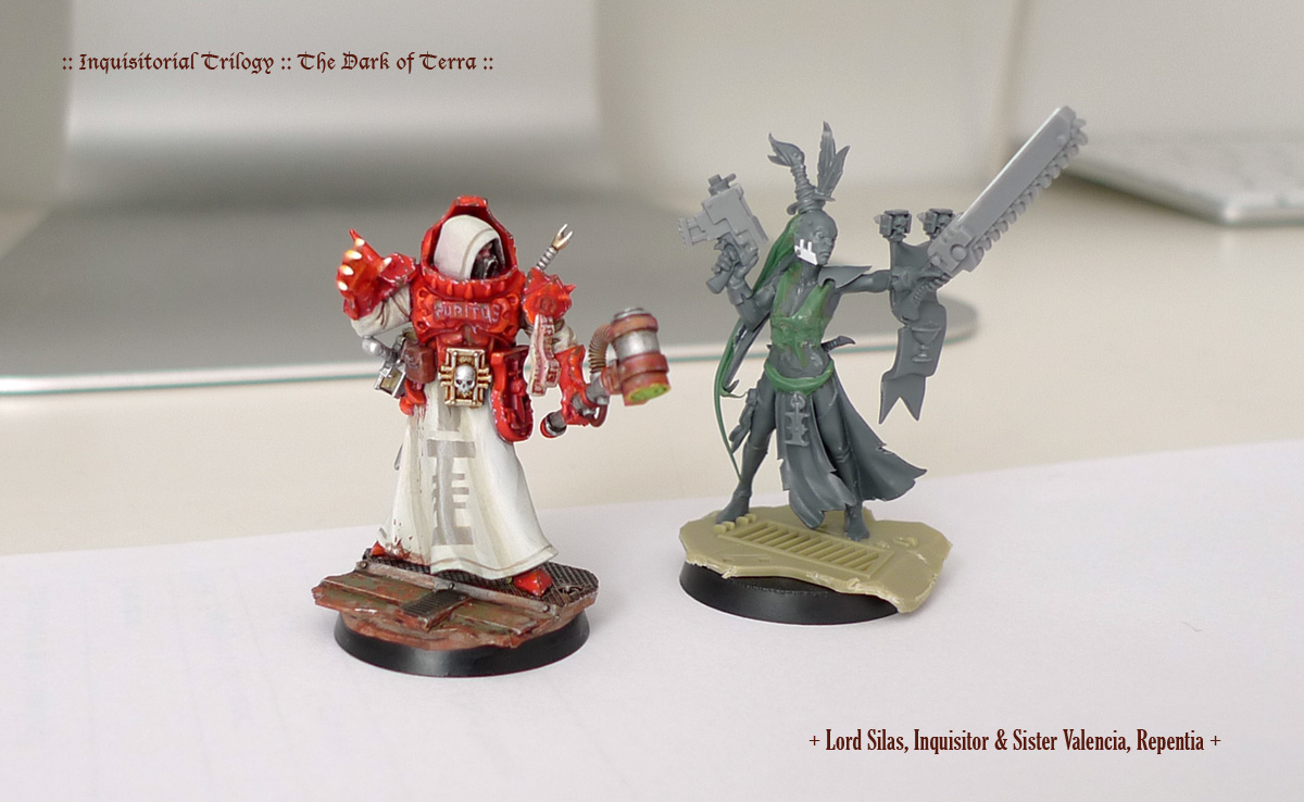
ReplyDeleteBoth looks very cool. I think the red came out quite well in this pic. Valencia's chainsword looks very big, maybe the sculpt is that tiny, I would try a guardsman chainsword (if that isn't what she's already carrying).
ReplyDeleteFantastic work. And you're going to love that Lumix.
ReplyDeleteAlways watching this - excellent CS
ReplyDeleteCS
painting a small inquisitor warband at the moment i realised that an overarching esthetic, other than unifying colours particular a very limited palette [ red, black, white, tan, khaki, iron and gold as usual ] was being unconciously employed bi miself - front facing and ready for action - no running, firing, side facing will be part of the conversion criteria - i wondered if its the same here as these two are facing sideways and a group dynamic suggests itself ?????
ReplyDeleteMr.JB - a group dynamic across several different miniatures always works, and serves to unify. A real sense of drastic movement is impossible to capture in a static miniature, by virtue of the miniature being forever static: exaggerated forms look a bit comic.
ReplyDeleteFor example, consider and compare Jes Goodwin's original Harlequins with the 2007 Goodwin/Diaz Harlequins. In the first series, extreme, acrobatic movement isn't encapsulated within one miniature (they look quite static on their own), but rather works as a series of wave-form flows across a unit (some up, some down, some in the middle), whereas in the 2007 miniatures, there's more of a frenzied, dancing, individualised narrative to each separate miniature. The latter are much better sculpts, and on their own, make for stunning models (it's no accident that they crop up in Golden Daemon so often), however, when put in a unit, they look messy and frantic - lacking in the grace and balletic choreography that's supposed to define them.
A sense of purpose is really crucial when building a disparate and aesthetically differentiated group, like a warband of individuals, even if that sense of purpose is just all of the members concerned looking in the same direction....
hmm, I seem to have completely forgotten my point... :) ... I'll continue tomorrow (sorry Migs!)
Mr Fulgrim - I'm curious; do you have a blog? Your comments are enlightening...
ReplyDeletecoming from an historical wargaming background albeit many years ago and always excited bi waves of infantry in line or massed blocks ive always tried top impress on colleagues the value of such - sometimes with success sometimes without - bi using miniatures from across ranges one has to make a concious effort to capture this dynamic and i wondered if people building inquisitor warbands and the like utilised such a thing .......
ReplyDeleteI love to design a dynamic for a group and also a dynamic for a group of groups (an army). What makes it interesting is to have different themes that supposrt the overall theme. I think with this one it'll become visible when the entry is done, so I won't go into it that much.
ReplyDeleteWith the "Ugly"/Shaddes Offe Greye/part one of the trilogy it was all about battle. For once I wanted a group where the bullets are really flying. There's only two models not directly letting fly or about to swing, and even they are about to raise a weapon or pointing!
Mr.Phiq - Thank you very much, that's very kind of you to say. I don't at the moment, but I'm thinking about starting one to log the progress of my Conclave, although I'm more of a thinker than a doer, tbh. I'd had a bit too much grog last night so I was worried that I wasn't making much sense and had gone off to a strange place :) The internet and ale should never mix, although I think I got away with it last night!
ReplyDeleteI think when you're building a small warband, to give a sense of narrative or shared purpose to a disparate group is really important: not only does it serve to unify these disparities, it also gives that sense of background, in that these odd-bods have a shared history and appear wiling to defend and protect one another from a common unseen enemy. This can be as simple as the group all looking the same way, or sometimes, when looking in different directions, willing to place their backs to one another (which speaks volumes about the trust they hold in each other in the heat of battle).
What I particularly like about Migs's compositions is that he does all of this, but then he'll often drop something completely different in there, too, like the adept in one of his Legion squads, almost hidden at the back behind the enormous bulk of a Marine, he appears to be looking to the floor, dropping something into a hole, entirely focussed on his own personal narrative - it suggests an higher purpose to the fighting and turmoil that the rest of the squad are engaged in. It's like when you're painting, a tiny spot colour used sparingly will really give life to miniature - Migs does this with narrative composition across a whole group, too.
This is the chap I mean, busying himself at the back of this photo:
ReplyDeletehttp://3.bp.blogspot.com/-HeBCN8RBkGE/TlaUQBJdH1I/AAAAAAAAAP4/anwId6sISz8/s1600/xx_wip12.jpg
In the finished piece, that particular operator got a water splash in his base, as if he has just dropped a timed explosive into a sewer.
ReplyDeleteThe shoulderpad of Valencia needs some work, make it a slightly bit cruder looking. The current design looks too sleek to be Imperial.
ReplyDeleteWhilst sleek technology is possible in the Imperium, the models supposed to represent a certain aesthetic feel. This kind of related to the discussion we've previously had on this blog regarding the representation of Xenos.
Each faction/race/whatever should have its own unique look and feel to set it apart from the rest. Whilst in the (deeper) background they might have things that are very alike, the models/artwork supposed to be just that, art... Make them all similar because these are possible and you won't be able to differentiate them anymore.
I'd be sort of tempted to agree with you Malika, however, in this case, it depends on how it's going to be painted. It looks like a tiny shield, and I was imaging it like some tiny coat of arms - possibly the heraldry of the Order that Valencia belongs to.
ReplyDeleteP.s - Migs, I'm glad that agent was dropping something after all, or my reading of him could have been really embarrassing ;)
Maybe you could add some small studs to the shoulder pad that Malika was talking about?
ReplyDelete@Ludovic: That was sort of what I meant yeah! :)
ReplyDelete